mondrian and the small, decided interruption
the colour pop outfit: one bright piece
lessons from albers and mondrian on building a calm base, choosing one saturated colour and placing it exactly where the eye should land.
the short answer
a colour pop outfit is a calm, low-contrast base, tonal grey, navy or camel with little pattern, plus one small, saturated colour placed where the eye should land, such as gloves, a lip or a shoe. don’t repeat the colour nearby, and if you echo it, match the shade exactly and keep the two far apart.
no colour is ever seen on its own. a red glove is a different red against a charcoal coat than against a camel one, and a different red again in a lit doorway than on a grey pavement. the painter and teacher josef albers built a famous book on that observation. in interaction of color, published by yale university press in 1963, he wrote that “color deceives continually”, and that this “makes color the most relative medium in art”, as the albers foundation1 records.
every good colour pop outfit is an application of that idea. you are not choosing a bright piece so much as choosing the surroundings that will make it look its brightest. the method itself is simple. build a calm, low-contrast base. add one saturated colour, kept small. place it where the eye will find it, and resist the urge to repeat it elsewhere. get those right and the outfit works almost every time.
a lesson from the 1920s
look at piet mondrian’s composition with red, blue, yellow, black, and gray of 1922, now at the toledo museum of art2. most of the canvas is given over to a large white square. the red is a single rectangle in the upper left, set against narrow bands of yellow, blue and black in the opposite corner. the red is not the largest thing in the painting, but it is the thing you remember, because everything else has been arranged so that it can be.
that is the proportion to aim for. the quiet parts of the outfit do most of the work, and the colour arrives as a small, decided interruption.
build the quiet field
the base should be low in contrast and low in pattern. tonal dressing is the easiest route: grey on grey, navy on navy, camel over cream. black with white works if both are plain. denim and neutrals, a white shirt, mid-blue jeans and a navy coat, makes a relaxed field. earth tones, chocolate with tan and olive, give a warmer one.
pattern is the enemy here. a bold check, a large floral or a strong stripe competes with the pop and wins. texture is a different matter. ribbed knits, herringbone, bouclé and corduroy all make the base richer without giving the eye somewhere else to land, and they make a smooth, saturated accessory look all the more polished by comparison.
choose one saturated colour
the pop should be clearly brighter and more saturated than anything else you are wearing, and it should agree with the base in temperature or contrast with it on purpose. this is where albers is most useful. the same cobalt looks electric against camel and almost polite against navy, so judge the colour against the clothes it will actually meet.
| pop colour | strongest against | effect |
|---|---|---|
| cherry or true red | navy, grey, black, cream | confident, classic |
| cobalt blue | camel, grey, ivory | crisp, modern |
| emerald green | black, camel, cream | rich, jewel-like |
| canary yellow | grey, navy, denim | bright, sharp |
| fuchsia | red, olive, navy | playful, fashion-literate |
| tangerine | navy, chocolate | warm, energetic |
red is the easiest colour to begin with, because we are used to reading it as an accent. a red lip, a red shoe and a red nail have been finishing sober outfits for most of a century, and the eye has learned to see them as intentional.
keep it small
the pop should be small relative to the outfit. gloves, socks, a lipstick, a hair clip or a watch strap are small pops, and the most versatile. a bag, shoes, a scarf or a belt are medium pops and still behave as accents. a coat or a jumper is large, and at that scale the colour stops being an accent and becomes the outfit itself. it can look wonderful, but it is a different exercise.
small pops have another advantage, which is that they can be taken off. if you change your mind at lunchtime, the gloves go in a pocket and you are back to a quiet field.
place it with intent
where the colour sits changes what people notice. near the face, through a scarf, earrings or a lip, it draws attention to expression. at the feet it grounds the outfit and reads as a considered fashion choice. at the waist, a belt, it defines shape.
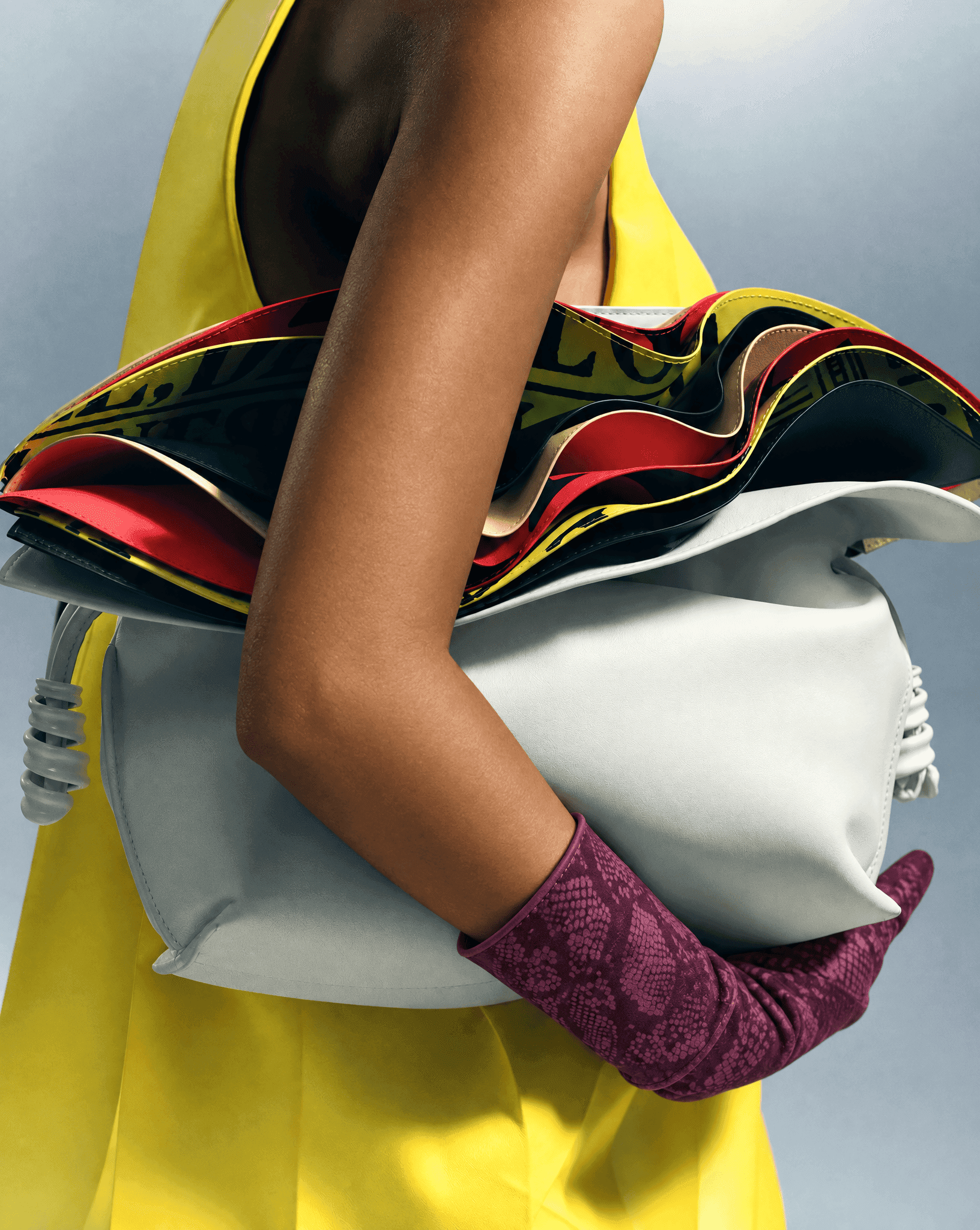
at the hands, it draws attention to gesture, and in winter that is the most effective place of all. gloves move every time you speak, reach, wave or lift a cup, so the colour feels animated rather than fixed. they also arrive and leave with your coat, which gives the colour a kind of choreography across the day: on in the street, off at the door, back on at dusk. paumier’s plum python-print suede gloves work on that idea, a single deep colour at the end of a quiet sleeve.
echo with care, or not at all
an echo is a second, smaller appearance of the pop colour somewhere else in the outfit. it can tie a look together, but it always weakens the effect of the first. no echo gives maximum impact: one red glove-shaped flash on an all-grey outfit. a distant echo, red gloves and a red sock, can work, because the two appearances are far apart. a near echo, red gloves with a red scarf, starts to look like a set.
if you do echo, match the shade exactly. two slightly different reds close together look accidental, which is albers’s point in reverse. colours change each other most when they sit side by side.
where a colour pop outfit goes wrong
the commonest is two pops in different colours, red gloves and a yellow bag, which compete instead of conversing. the second is a pop that is not bright enough. a dusty rose against grey simply blends in, because the contrast is too small for the eye to register it as a decision. the third is a noisy base. if the outfit is already busy, there is nowhere for the colour to land.
the last is quality. the bright piece is the one people look at most closely, so it is worth choosing well. a fine leather or a heavy silk carries colour with depth and a little light; a thin synthetic makes the same colour look cheap.
the beauty of a colour pop is how little it asks: one good piece and some discipline around it. if you would like that piece to be at the hands, start with our guide to colourful gloves.
quick answers
- what is a colour pop outfit?
- a mostly neutral or tonal outfit with one bright, saturated piece that draws the eye. the piece is usually small, an accessory rather than a garment.
- what is the best colour for a colour pop?
- red is the most versatile and the easiest to begin with. cobalt, emerald and yellow also work well, provided the base is quiet enough to let them read.
- how many colour pops can i wear at once?
- one is the classic rule. two can work if they are the same colour and placed far apart.
the gloves in this piece
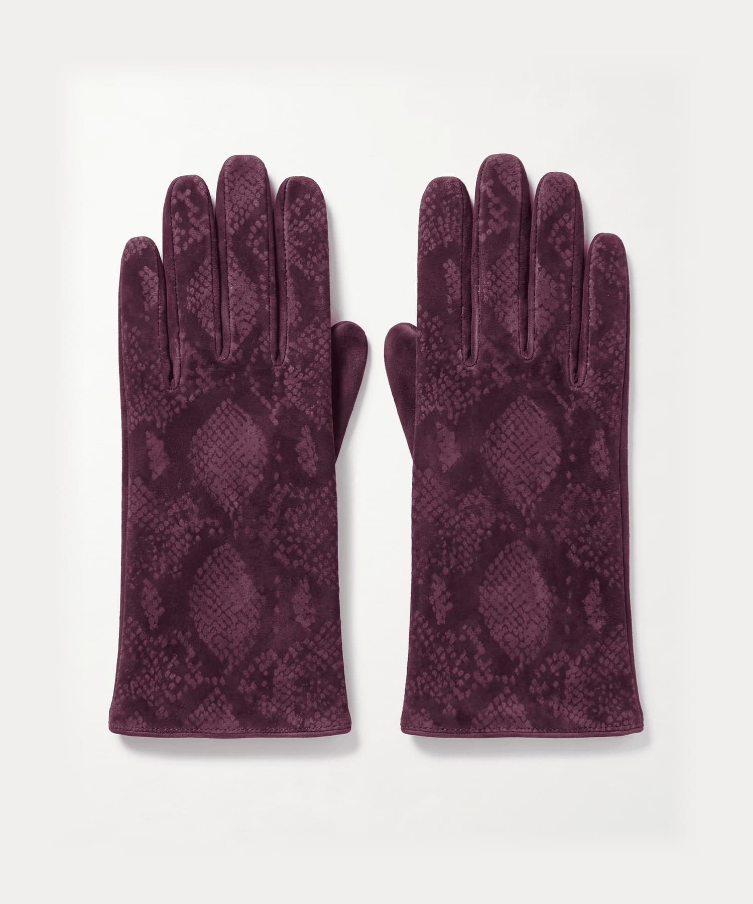
every style is size 7 and ships tracked from the uk, free to uk addresses, with returns accepted within 14 days of delivery. delivery & returns
keep reading
sources
- The Josef and Anni Albers Foundation, Interaction of Color
- Toledo Museum of Art, Piet Mondrian, Composition with Red, Blue, Yellow, Black, and Gray, 1922